If you’ve recently been inspired by color and are ready to transform your home in San Diego, we are here with all the tips and tricks!
Choosing a color scheme for your home, or even one room, is a lot! We get that color can be overwhelming. It’s exhausting just trying to find the right white for one room, let alone picking the color scheme for your entire home. That’s why your go-to residential design team at ASR Design Studio is sharing exactly how to pick color, plus some helpful hints along the way to make it so much more enjoyable.
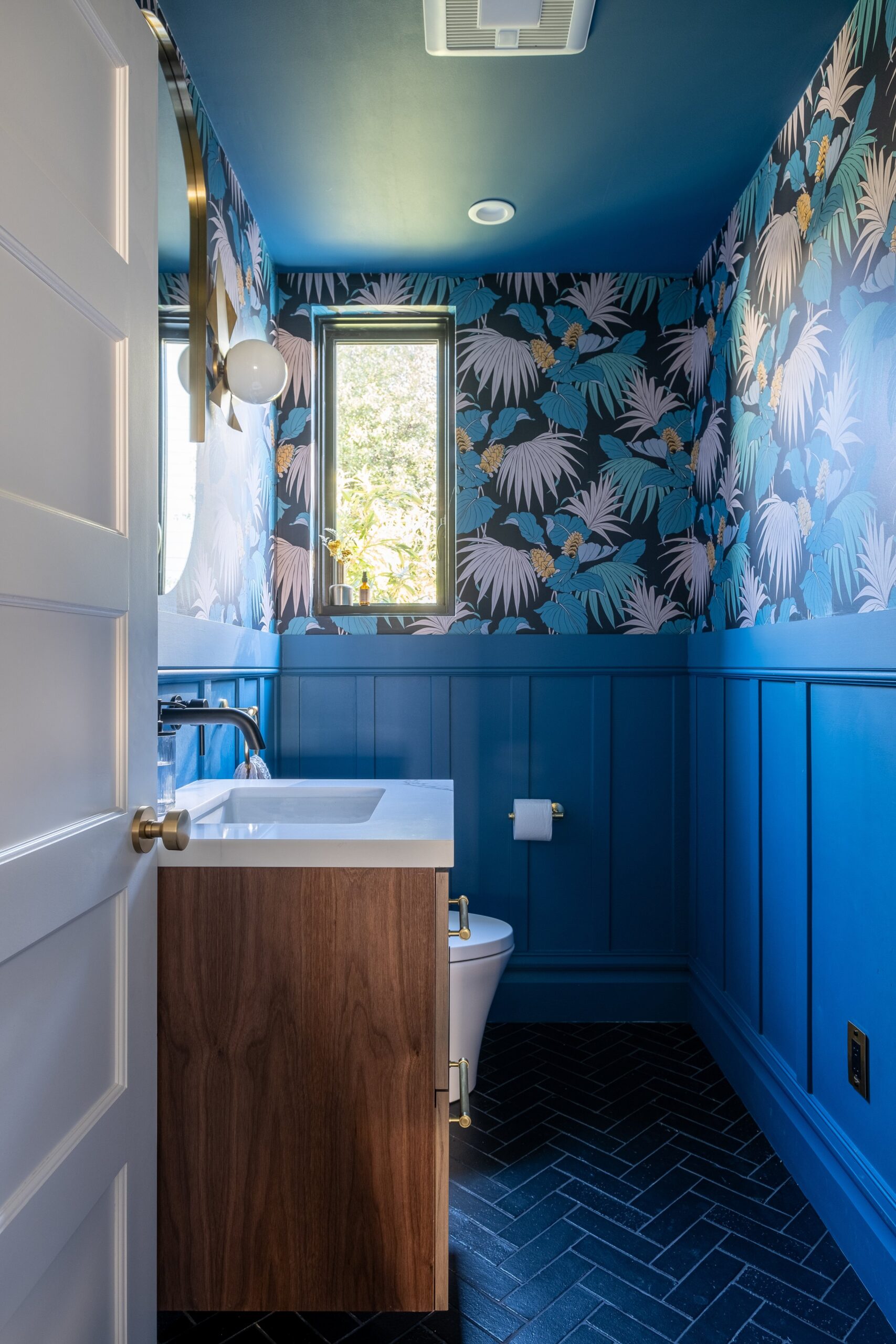
The short answer
Choose a room’s color scheme by starting with how you want the space to feel, building on a warm or cool neutral base, and adding accents with the 60-30-10 rule (60% main color, 30% secondary, 10% accent). Keep tones consistent from room to room, and test paint samples in your own light before committing.
How to choose a color scheme for your room
You’re on the road to creating your dream home, and we could not be more excited! Your home should be a place you fall in love with over and over again, and color is a huge part of that. When choosing your room’s color scheme:
Start with the room’s purpose and mood
There’s no doubt that color is powerful. We’ve seen this firsthand with our clients in San Diego: color can make or break a space. So we always ask our clients, and you should ask yourself, what is the purpose of this room, and how do you want to feel in it?
Color theory plays a huge part in how we feel, our mood, and the overall vibe a room gives off. A great example is the bedroom. If you want a cool and calm vibe, you can go for a beautiful sky blue, or if you’re looking for something moodier, you could go with a deep forest green. Color makes a huge difference to the aesthetic and the mood!

Start with neutrals, then add accents
When looking at your room’s color scheme and your overall home, it’s always best to start with a neutral base and add accent colors along the way.
Neutral colors can be broken down into two categories: warm or cool. Warm neutrals give a cozy vibe; think sweater weather. Cool neutrals give a more sophisticated look and feel. Which neutrals you choose depends on you and what you already have in your home. This is where we see a lot of people get stuck: finding the right undertone to match the rest of your home can be tricky. If you’re struggling with this, get in touch with us. We promise we can help and have fun doing it. Here is a cool color wheel tool if you need a little extra help.
When in doubt, use the color wheel
Color is overwhelming, and it’s even harder when you’re choosing a scheme for your whole home. When you start feeling overwhelmed, stick to the color wheel. Yes, we’re transporting you back to third grade art class, but your art teacher was definitely onto something.
The color wheel gives you proven palettes you can use, and it’s a chance to get inspired by all the different color combinations you could try.
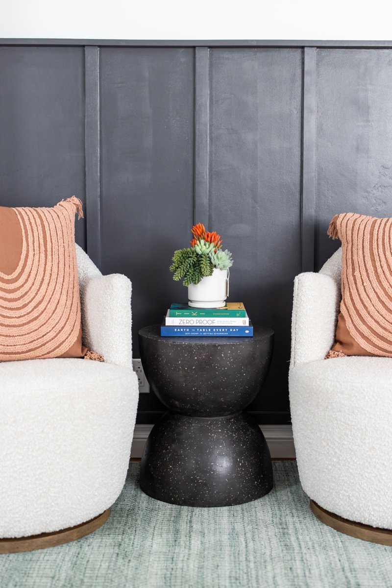
Keep it cohesive from room to room
When picking the perfect color scheme for each room, it can be easy to get excited and pick up a bright red or yellow that you absolutely love, but we have to stop you right there. As much as we love bold colors, you have to think about color long-term, what you’ll enjoy, and how colors will make you feel. That bright, fiery red might not be the most calming color for your living room. Instead, create impact by staying cohesive with the rest of your home: bring the same tones and warmth through in different variations.
If you want to go bold, try the 60-30-10 rule: about 60% of the room in a dominant color, 30% in a secondary color, and 10% in an accent. Balance bold color with neutral elements such as white walls, natural wood tones, and metallic finishes so the space feels vibrant but polished.
Insider tip
If you want to go bold but don’t feel like committing to the entire room, use your bold color as an accent. It’s a great way to get the best of both worlds!
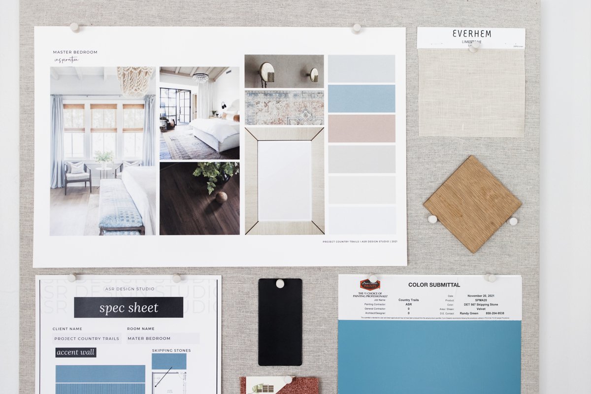
Use tools to help you visualize
By now you know we’re huge fans of Pinterest. We can scroll for hours! It’s great because you not only get inspired, you can also put together a mood board.
But let us in on a little secret: Canva Colors. This tool is the best-kept secret. You can use the color palette generator, look up color meanings, browse palette ideas, or use the color wheel, and it’s 100% free. While it won’t paint your room for you, it’s a great place to start visualizing and have some fun playing with the possibilities.
How to pick the perfect paint color
Now we’re getting into the nitty-gritty of picking the perfect paint color for your home. With 1,000,001 colors to choose from, it’s no wonder people struggle, but never fear. We’re here to help!
1. Get inspired
Before you do anything else, you need a vision. Go wild with a mood board on Pinterest; it’s the best way to see what you want to achieve with your room’s color scheme. Don’t stop at Pinterest, either. Take photos of fabrics, colors, and anything else that piques your interest.
2. Gather swatches, then refine
Once you have your vision, head to your local paint store. Ideally, bring something from your room so you can compare it to the paint swatches. Grab what piques your interest, but no more than 10. Take them home into the room you’re painting, look at them against the room’s lighting and your furniture, and narrow them down to your top three.
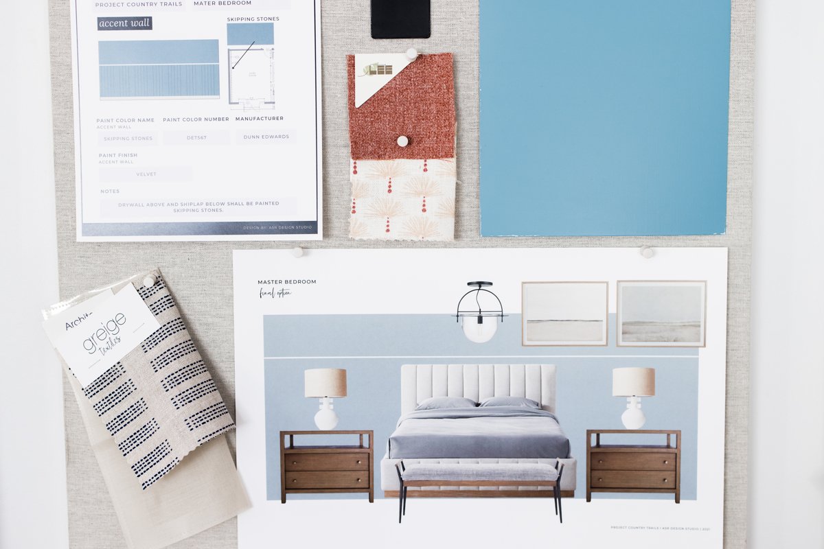
3. Test, test, test
We know you’re excited to open a fresh can of paint, but first, test your color so you can see its variations. We recommend living with it for at least 48 hours. Paint a swatch in the room you’re considering, one in a darker area and one next to a light source, to see how different the color looks depending on the light. Check it at different times of day so you can see how it changes.
Insider tip
Don’t be afraid to take your time here. Paint is replaceable, but you’re investing in your home, so it’s better to take an extra week to decide than to make a costly mistake.

From challenge to solution
Color is one of the most powerful and most overwhelming decisions in a home. Here is how we turn endless options into a palette you will love living with.
01 · THE CHALLENGE
Too many colors, no clear direction
Homeowners fall for a color in the store, then find it clashes with their finishes or makes the room feel chaotic, so they repaint or give up on color altogether.
02 · OUR APPROACH
Purpose first, then a cohesive palette
We start with how each room should feel, choose a neutral base with the right undertone, then layer accents using the color wheel and the 60-30-10 rule, testing samples in your actual light.
03 · THE RESULT
A home that flows and feels like you
Each room has its own personality, but the whole home feels connected, calm and intentional, with no costly repaints.
Frequently asked questions
Decide how you want the room to feel, choose a warm or cool neutral base, then add one or two accent colors that complement it. Test samples in the room before you commit.
A balancing guideline: about 60% of the room in a dominant color, 30% in a secondary color and 10% in an accent color, usually through accessories and art.
Use it as an accent, on one wall, a statement piece of furniture or accessories, and balance it with neutrals, natural wood and metallic finishes.
At least 48 hours, and ideally several days. Check it in morning, afternoon and evening light, in both bright and shadowed spots.
Keep reading
- Falling in Love with White Paint, All Over Again
- Ultimate Rug Guide: Which One to Choose & Where to Place It
- What Interior Designers Actually See When They Enter Your Home
- The Ultimate Guide to Luxury Home Interior Design in San Diego
Fall in love with where your life unfolds.
ASR Design Studio is a full-service residential interior design studio based in Escondido and serving San Diego County. We specialize in renovations, new builds, furnishing and thoughtful styling, blending our signature modern coastal style with the way you actually live. We take on a limited number of clients each year so every home gets our full creative attention.

Comments +