White paint doesn’t have to be dull. It conjures images of generic, personality-free rooms — but the right white, chosen with intention, can transform a space.
Today we’re sharing the best white paints we know, the ones that consistently take a room from blah to absolutely beautiful. However, before we get to specific shades, there are a few things worth understanding first — because choosing white well is genuinely more nuanced than choosing almost any other color.
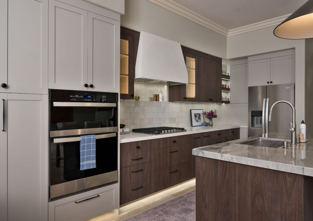
The short answer
The best white paint is the one whose undertone suits your light. Test large samples on several walls, live with them for three to seven days and check them morning, afternoon and night against your wood tones and finishes before you commit.
Steps to Find the Best White Paints for Your Home
So before you commit to any paint color, do these few things first.
1. Order a quart of paint, or better yet, a large peel-and-stick sample. For this, we love Samplize — their samples are large enough to actually judge a color, unlike a tiny store chip.
2. Paint a large swatch directly on your wall, or place your sample sticker there. Then leave it up for at least a week so you can see how the shade behaves in your actual space.
3. Place a swatch in a shadowed area and another near a window with abundant light. After all, the same white can read completely differently just a few feet apart.
4. Let it sit for three to seven days. Look at it morning, afternoon, and night, and view it against your wood finishes, furniture, tile, and flooring before committing. In fact, this step alone can save you thousands of dollars in repainting.
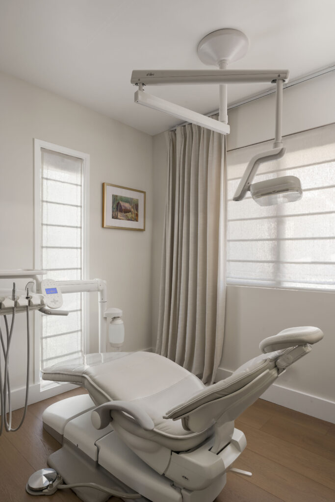
What to Watch For Once You’ve Found a Shade You Love
Once you’ve narrowed in on a white you really like, there are a couple of things to double-check before you finalize it.
Lighting consistency. Make sure you evaluate the paint under the lighting you’ll live with long-term. After all, your home’s lighting dramatically changes how a white reads. For living rooms, bedrooms, and dining areas, we recommend 2700K to 3000K for a warm, inviting glow. In kitchens and workspaces, however, we love 3500K to 4000K because it more closely mimics daylight. We also recommend putting lighting on dimmers throughout the home. That way, everyone can adjust the light to suit the time of day.
Natural light exposure. Similarly, the amount and direction of sunlight your room gets affects how warm or cool a white appears. So always evaluate the color in your own home, never just in the store.
Why White Paint Is So Hard to Get Right
To begin with, every white paint carries an undertone — gray, beige, blue, red, yellow, or green — and that undertone determines how the color actually behaves once it’s dry on your walls. As a result, a white can look completely different on the chip than it does in your space.
For example, warm tones (red, orange, yellow) create an inviting, cozy atmosphere. Cool tones (green, blue, violet) offer a crisp, clean appearance. Because undertones are genuinely difficult to detect from a small paint chip, ordering a real sample is essential — it’s the only reliable way to see what you’re actually getting.
The Best White Paints Our Clients Love
Dunn-Edwards
One of our favorite paint brands. Dunn-Edwards offers high-quality paint, a genuine commitment to environmentally friendly practices, and a reputation for excellent customer service. Because the company started in Southern California, it designs its formulas with coastal weather in mind. As a result, they’re a natural fit for our San Diego projects.
| Lace Veil DE6372 | Free Spirited DEGR09 |
| Coconut Grove DEHW03 | Igloo DEW379 |
Bauwerk
One of our favorite lime-wash paint brands. Bauwerk is breathable, durable, and easy to apply, with a naturally antibacterial quality. In addition, their color cards are hand-painted, and the brand is committed to environmentally responsible production.
Farrow & Ball
At the top of our list for its high-quality, highly pigmented colors. Moreover, Farrow & Ball paints have a unique depth of color, respond beautifully to changing light throughout the day, and carry low VOCs.
| Wevet No. 273 | Strong White No. 2001 |
Sherwin-Williams
Meanwhile, Sherwin-Williams offers excellent color consistency, superior coverage, and a beautiful range of whites. That’s why designers love this brand for its dependable performance and strong customer support.
| Snowbound SW 7004 | Eider White SW 7014 |
| Pure White SW 7005 | Alabaster SW 7008 |
Benjamin Moore
Benjamin Moore rounds out our list with extensive color selection, excellent durability, and low VOCs. Also, designers and homeowners alike love the brand’s customer service and the convenience of its extensive retail network.
| Chantilly Lace OC-65 | White Dove OC-17 |
| Simply White OC-117 | Cloud White OC-130 |
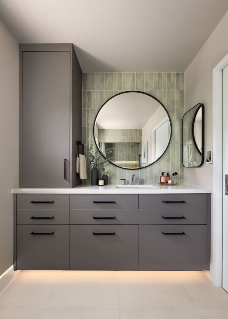
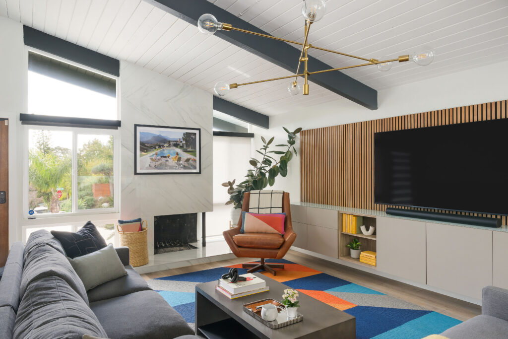
A few of our favorite white paint colors in action!
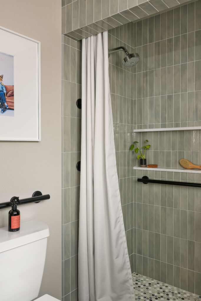
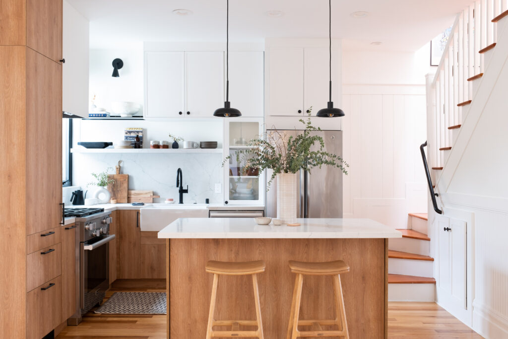
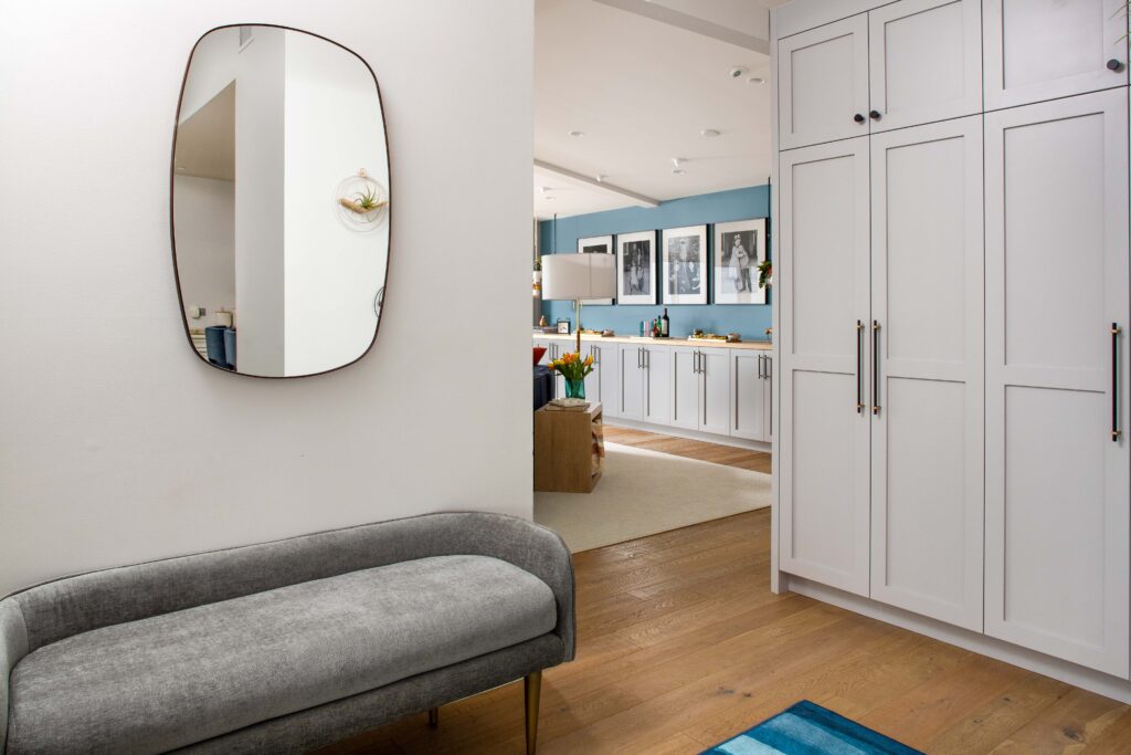
PAINTS WE LOVE FOR OUR CLIENTS
- Project Gabilan: Dunn Edwards Bone Dry DEGR22
- Project Bonview: Benjamin Moore White Dove OC-17
- Project De Mayo: Dunn Edwards Coconut Groove DEHW03
Of course, you can see these whites in their full context across our portfolio. In our professional experience, these are the best white paints to help you create a cohesive, well-designed home — we hope you find one you love.
Finally, if you’d prefer a seamless, guided experience in selecting the right white for your space, explore our design services or book a discovery call below.

From challenge to solution
Picking a white sounds simple, until the “perfect” white turns yellow, gray or blue on your walls. Here is how we take the guesswork out.
01 · THE CHALLENGE
Whites that look wrong at home
A white that looks crisp on a chip can read cold, dingy or yellow once it is on the wall, because every white carries an undertone that reacts to your light.
02 · OUR APPROACH
Test undertones in your real light
We sample large swatches in bright and shadowed spots, review them at different times of day against your finishes, and shortlist trusted whites matched to the room’s exposure.
03 · THE RESULT
A white that feels intentional
The room looks fresh and warm in every light, and the white supports your furniture and finishes instead of fighting them.
Frequently asked questions
Identify the undertone you want, then test large samples in the actual room. Look at them in natural and artificial light over several days, next to your floors, cabinetry and fabrics.
Light direction, bulb color and surrounding colors all change how a white reads. North-facing rooms pull whites cooler and grayer, while south-facing rooms warm them up.
Warm whites feel cozy and work well in cooler, north-facing light. Cool whites feel crisp and modern and suit bright, warm light. The right choice depends on your room and finishes.
Keep reading
- The Ultimate Guide to Luxury Home Interior Design in San Diego
- What Interior Designers Actually See When They Enter Your Home
- How to Style Shelves in Your Bedroom or Living Room: 7 Pro Tips
- How to Choose a Color Scheme for Your Room: Designer Tips
Fall in love with where your life unfolds.
ASR Design Studio is a full-service residential interior design studio based in Escondido and serving San Diego County. We specialize in renovations, new builds, furnishing and thoughtful styling, blending our signature modern coastal style with the way you actually live. We take on a limited number of clients each year so every home gets our full creative attention.

Comments +