When this travel-loving couple wanted us to redo their entire home, who were we to say no?
Meet Project Country Trails: A 2,157 square foot four-bedroom and two-bathroom home in Bonita, California. (Did we mention it was destined for a dream home makeover?)
For 25 years, our homeowners lived in a one-bedroom apartment in San Francisco. When they moved into their ancestral home, their friends and family started wondering. They wanted to know when they can expect an invite to come and see it. With plenty of room to host their loved ones, this couple was ready to transform their beautiful home. They wanted it to feel like them: fun, lively, and adventurous.
It was our job to make it happen — and we got right to work.
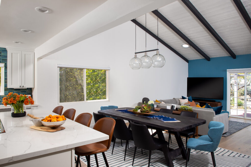
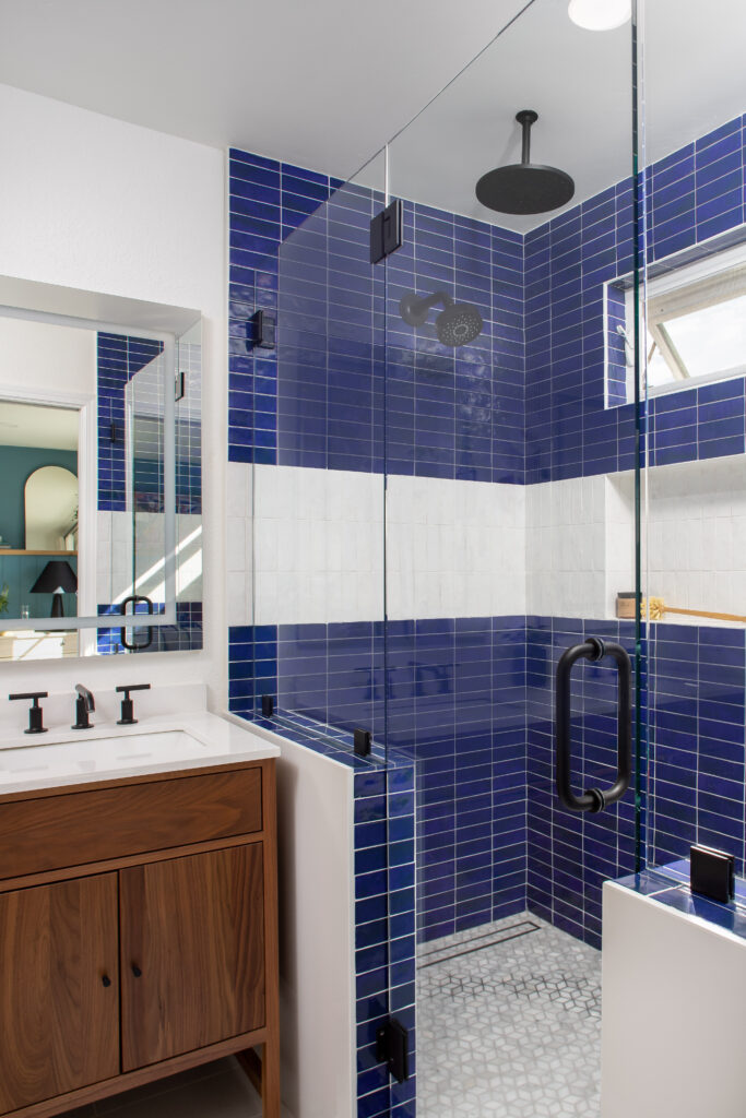
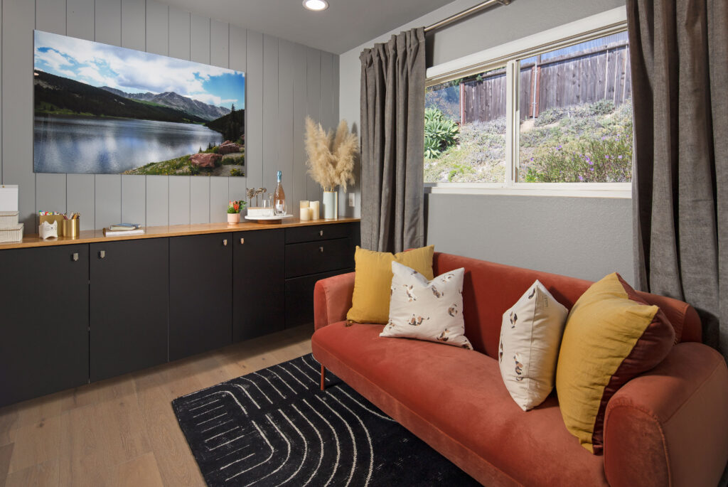
Our clients had an eclectic style rich in history, culture, and a lifetime of adventures. We wanted to highlight these stories in their home and give their memorabilia places to be seen and appreciated.
Whole Home Updates
“When we moved in, it was such a novelty to live in a proper house. But it still felt like the in-law’s home,” our clients told us. “Our dream was to make it feel like our home.”
We painted the exterior, added new flooring, doors, trim, hardware, as well as recessed lighting throughout the home. We wanted an immediate wow-factor upon entering the home.
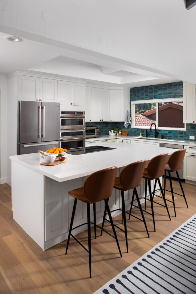
First up, the kitchen
Brand new cabinets stood alongside blue and green tile. They created a crisp, inviting space for the family to prep dinner. This area was perfect for entertaining. We tiled all the way to the ceiling. This created a cohesive feel. We placed quartz inside the window ledge to give it a custom look.
We enlarged the island to get in more storage and seating.
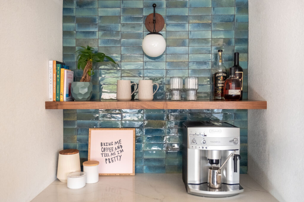
They also have a separate bar area, where we did storage and a beverage fridge. A walnut floating shelf and wall sconce gave a mid-century modern spin. (Just like the globe lights above the dining table.)
Oh, and did we mention there’s a barista bar?!
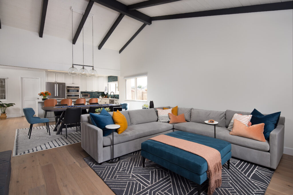
Then we took on the Living Room
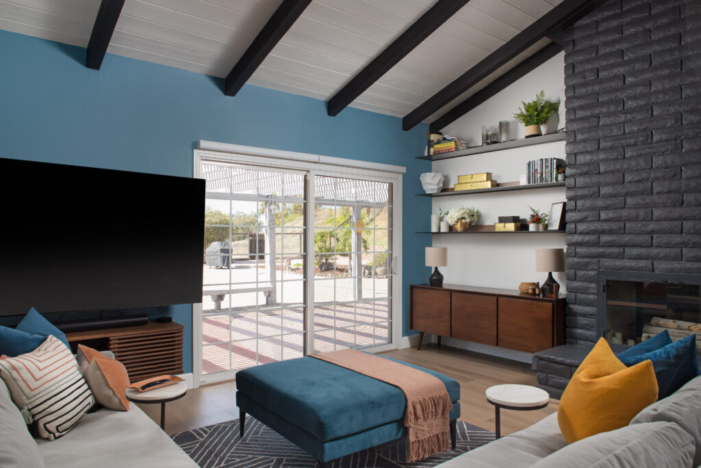
This space was designed to be a place for entertaining. It is also perfect for curling up for a cozy evening in. We sourced all the furniture for this room and started from scratch.
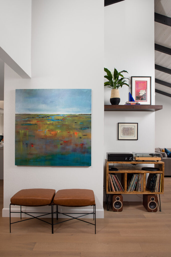
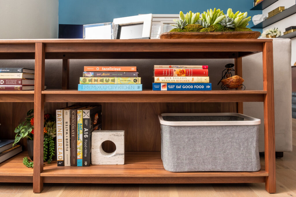
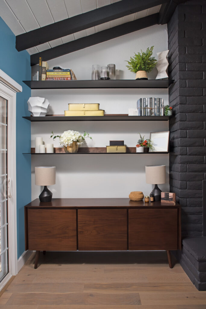
Right next to the fireplace they have a nook where we placed a console to hide all their workout gear. (Who wants to be reminded of working out when watching TV? Not us!)
Floating shelves were added above for more storage and family photos.
Finally, the beautiful exposed beams were transformed into a feature point of the space. They no longer just blend in.
Next on our list? The Primary Suite
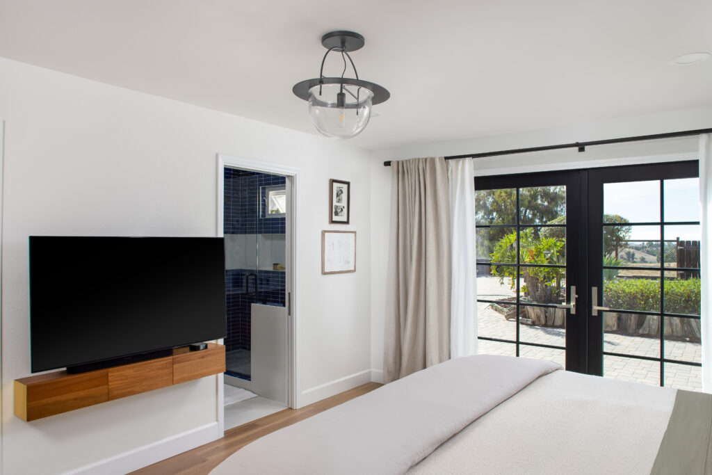
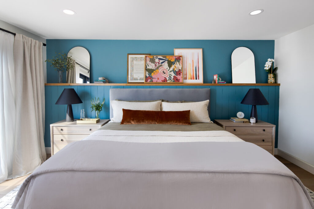
We wanted to create a calm sanctuary where they would end the day.
The blue wall packs a punch, while the lamps, side tables, and arched mirrors keep it symmetrical and calm.
The Primary Bathroom
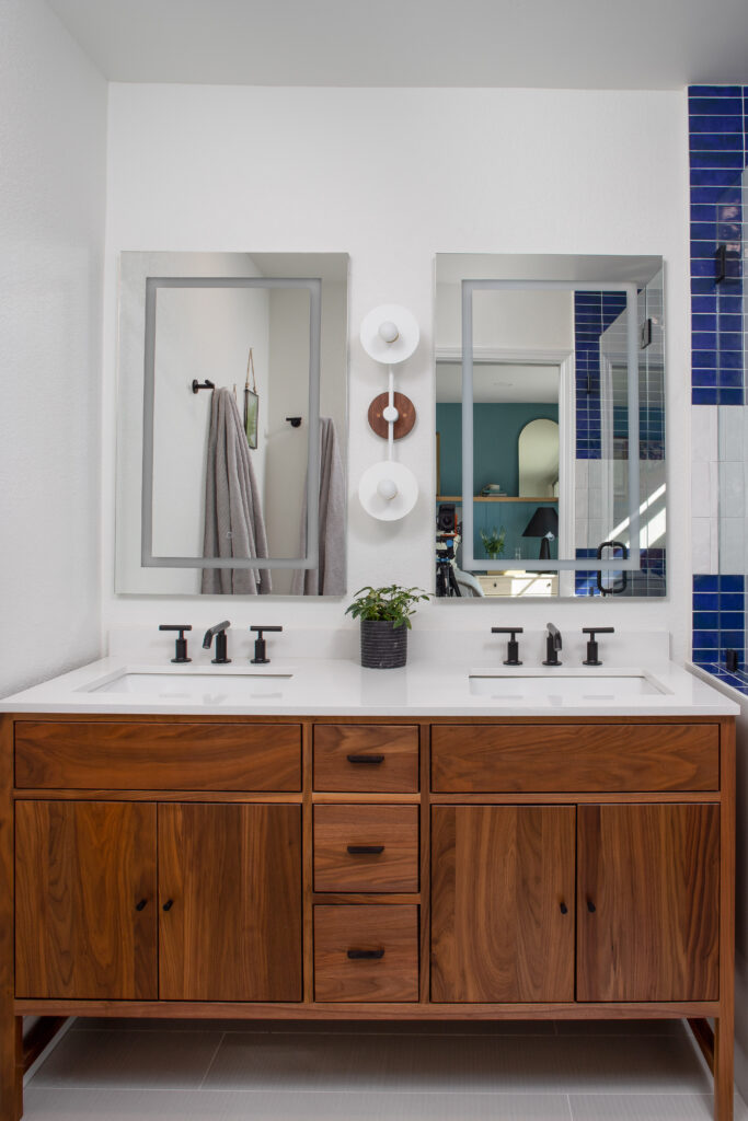
With a walk-in shower and bench. The couple loves walnut. So, we chose a ready made walnut vanity that fit the space and provided ample storage.
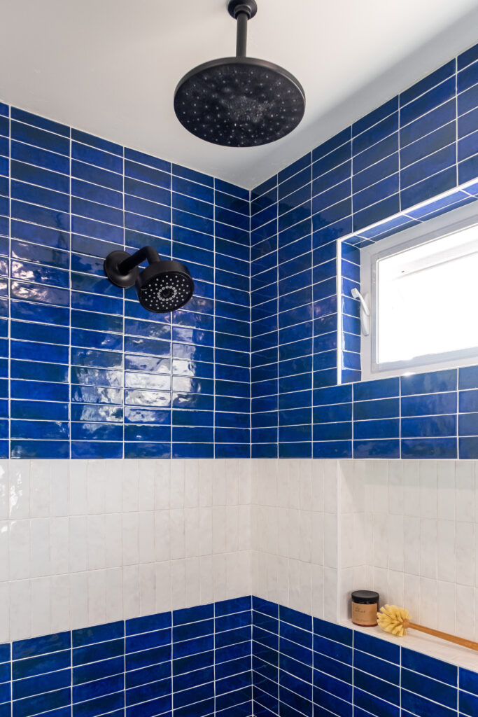
The shower was done in a vibrant blue to reflect the ocean. The stripe of white tile flows into the niche and we added a window for more light and ventilation.

Let’s take a look at the Office
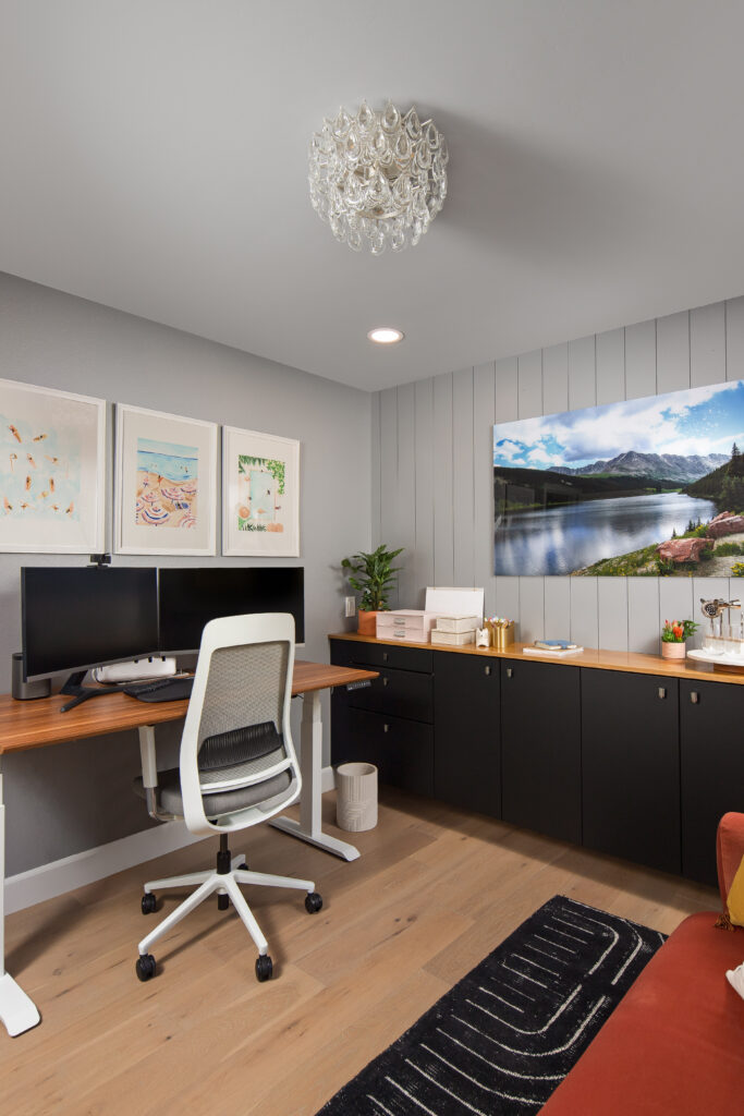
Our homeowner works from home and wanted a glamorous sanctuary space for herself. We painted the whole room in a soft grey and gave her a glass tear drop flush mount light fixture (she loves good lighting!). A wood height adjustable desk and an ergonomic desk chair were selected for ideal comfort.
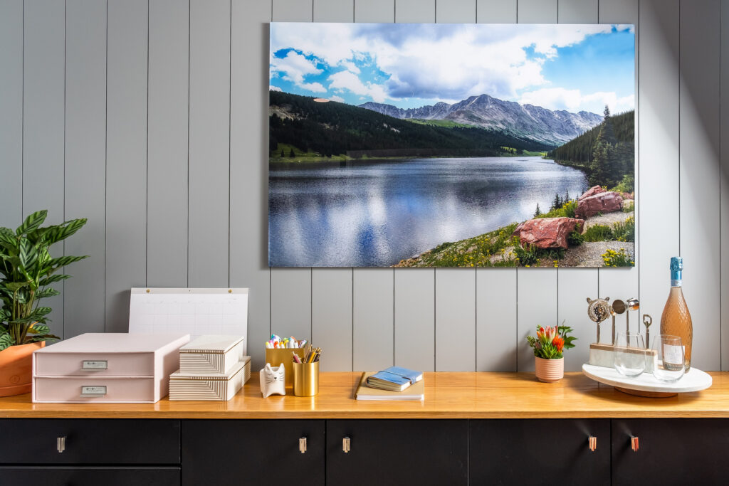
We gifted her with floating cabinets from IKEA in a black finish with silver hardware. Some shiplap above gave the space personality, and a white oak top provided warmth and texture in the space.
Her hubby found a colorful sofa in velvet where he would lounge and chat with her while she works. We elevated the space by grounding it with a black and white rug.
Finally, we added some frosted glass doors. You can’t see in, but they make the space look bigger. It’s a win-win. We also incorporated some velvet drapery for that glam and refined look.

Lastly, we did the Mexico Room (aka the Guest Bedroom)
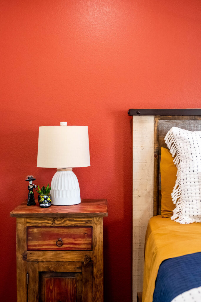
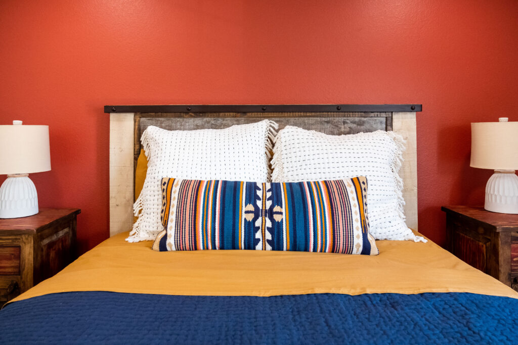
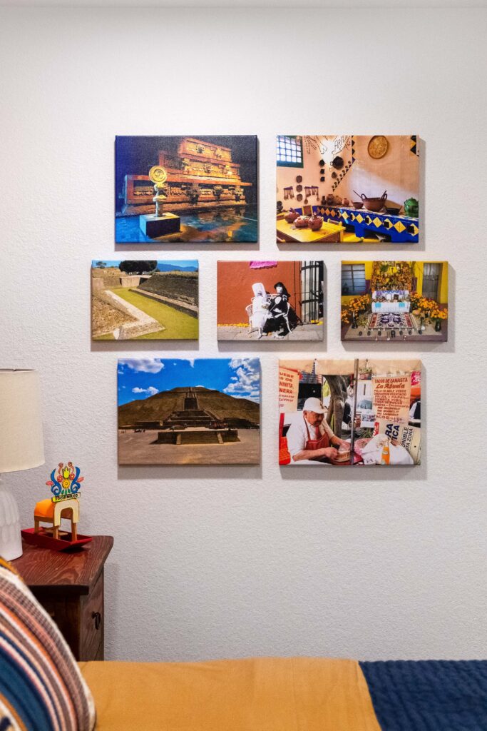
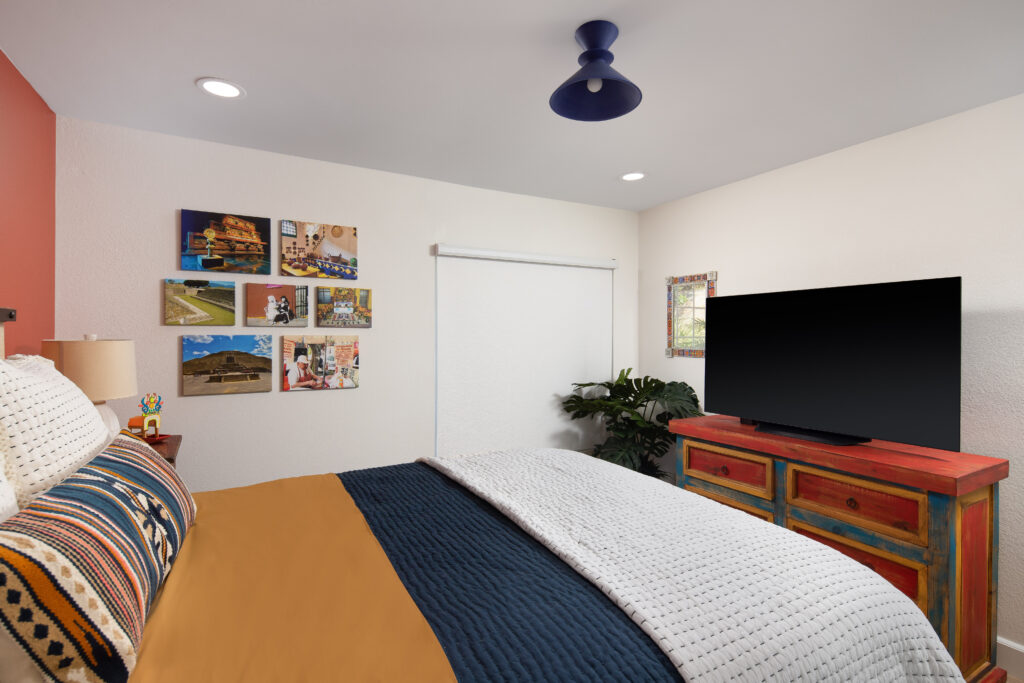
The couple had bright, colorful wood furniture from Mexico and wanted this to be a themed room. We were instantly on board. Nothing is more fun than a room with a theme (and a view, of course). We created an accent wall of bright orange red. This helped tie in the furniture. With a deep blue rug to help tone down the bright wall color. This addition helped ground the room and colors. The white textured side lamps gave a contrast to the colors in the room. The end result? Colorful yet soothing.
oh, and the homeowners?
They loved it:
“Our experience partnering with Ariel and the ASR Design Studio team on our full-house redesign was great. Ariel got to know us, listened to our vision, was upfront with us and guided us through the process with professionalism, commitment, care and talent. We are thrilled with the result.” – Lisa
FALL IN LOVE with where YOUR LIFE UNFOLDS
ASR Design Studio is an exclusive residential interior design studio in Southern California.
We specialize in remodeling, new builds, furnishing, and thoughtful styling.
Our approach to creating homes blends our signature style of modern coastal design with our clients’ personal preferences, lifestyles, and objectives.
We believe that your home should tell the story of who you are.