Mor Furniture x ASR Design Studio: Behind the Scenes of our Design Day (Part Two)
We were recently invited to style some spaces for Mor Furniture’s Designer Series, where we used their furniture pieces to design two rooms — a bedroom and a living room.
Psst…In Part One we designed two other rooms, a dining room and living area, so check that out here if you haven’t already!
We adore how the spaces turned out, and wanted to give you a peek at how they came together.
PSST…THIS BLOG POST CONTAINS SOME AFFILIATE LINKS, MEANING WE GET A SMALL COMMISSION IF YOU MAKE A PURCHASE. JUST THINK OF US AS YOUR VIRTUAL INTERIOR DESIGNERS! EVERYTHING WE RECOMMEND WE LOVE AND WOULD TRULY USE FOR A DESIGN PROJECT.
first up, the living room
The starting point for this space was Mor Furniture’s Petrillo 3 Power Sofa in Gray.
We decided to have some fun with this room and make it more of a man cave space. Not our usual California Coastal style, but hey, we’re always up for something new!
We settled on a musical & masculine vibe. How fun is that?!
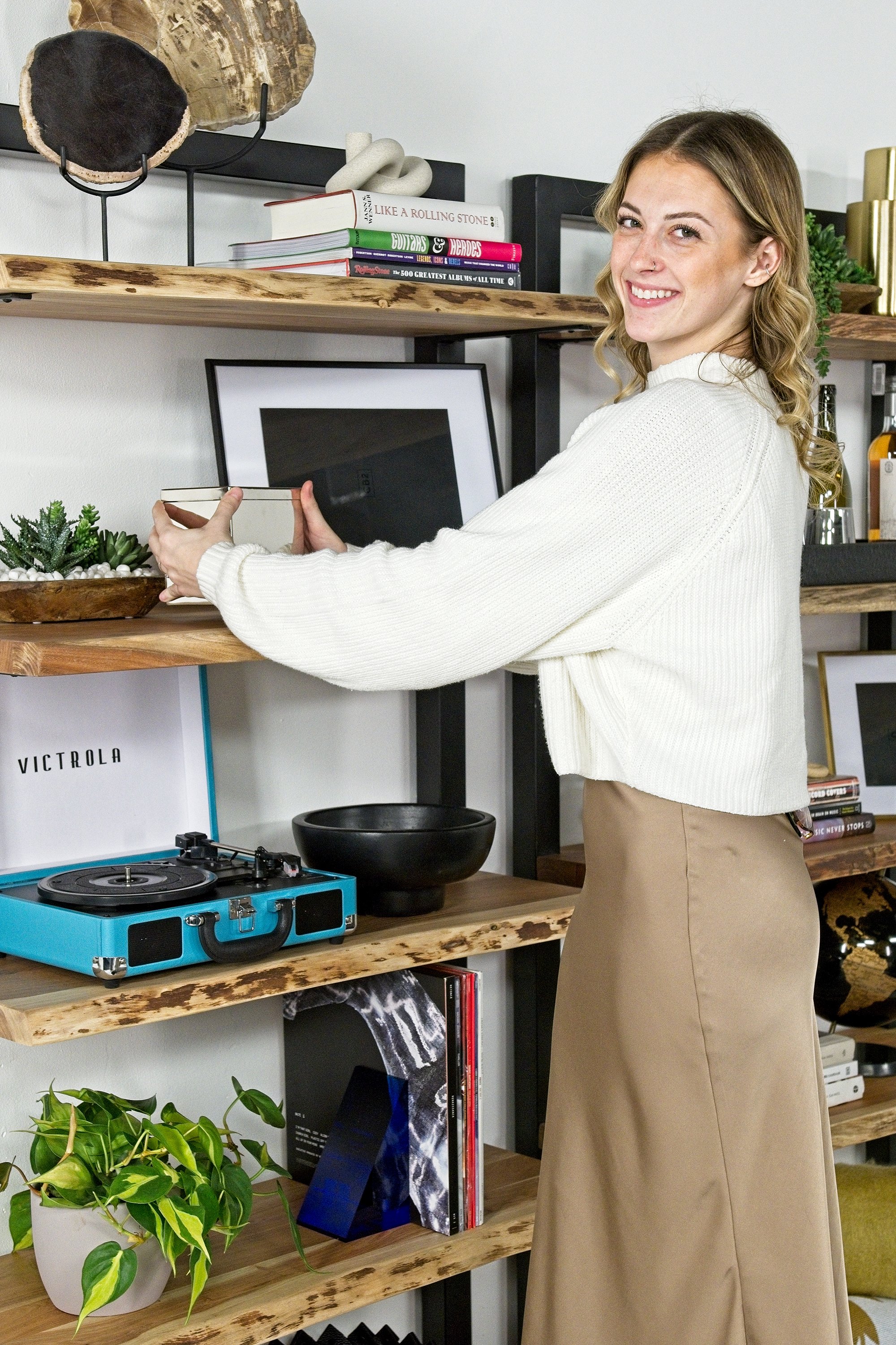
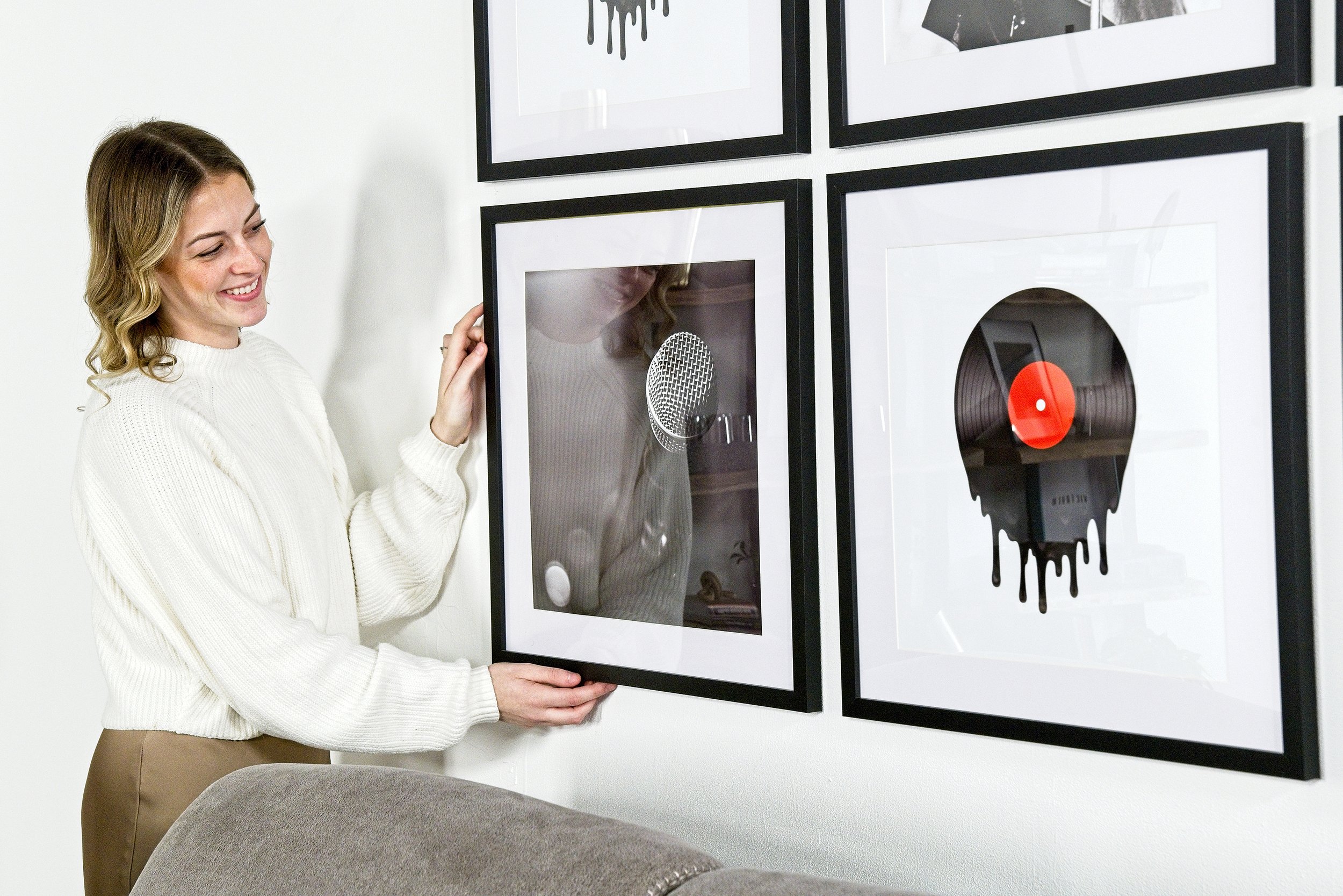
With that in mind, we focused on some unique accessories for the space
We had some other fun Mor Furniture pieces, like their Trailbend Accent Table and Paradox Coffee Table.
By adding in a cowhide rug, open bookshelves, and vibrant pops of color, this space felt polished yet rugged.
To liven it up a bit, we finished it off with some musical accessories and plants.
to get the exact look for yourself, here are some more furnishings we used in the space
From CB2, we pulled in the following pieces:
Tatum Marble Picture Frames
Asha Taper Holders — this tabletop decoration from Anthropologie has a similar vibe
Neat Smoke Double Old Fashioned Glasses
Polished Nickel Recipe Box — these marble boxes from Williams Sonoma would also be fun in a space like this
Deep Blue Acrylic Bookends — shop these cool bookends from Threshold with Studio McGee for a similar aesthetic
Degodd Silver Cocktail Shaker
Black Marble Globe
We also grabbed some accessories from our Salt + Citrus Home shop, like the bright throw blankets and the cowhide rug.
now we want to share a few design tips you can use in creating your own living room (or any space!)
#1 — neutral furniture allows you to play with fun accessories
We were able to use bright yellow throws, open shelving with unique accessories, and bold wall art because the furniture was neutral. If your furniture was over the top, the accessories would need to be played down a bit so as not to create a chaotic space.
#2 — natural pieces will warm up the space
By using wood details, like the bookshelves and side tables, we kept the room from looking stark. The plants added a lively touch as well. Remember that modern and sleek furniture and decorations are great, but you’ll want to balance them out with some natural touches.
#3 — ground the space with area rugs
Adding an area rug to your space will ground everything together. Otherwise, it could appear like all of your furniture and furnishings are floating in the room. Your rug will pull everything together and create a cozy, cohesive space.
What do you think of this living area?
If you want to shop the gorgeous furniture from this space, head over here.
next up, the bedroom
We took the bedroom in a different direction than the living area with more of a Boho Chic style.
We started the space with Mor Furniture’s Duo Linen Adjustable Foundation Bed in Gray. We also used their Melbourne Nightstand (in Brown), Melbourne Dresser (also Brown), and Sonoma Rug in Ivory & Blue.
We ultimately wanted this Boho Chic space to feel airy and serene — the perfect combination for a cozy place to rest after a long day.
By keeping the furniture neutral, we were able to have an eye-catching focal point: the wall art above the bed
We pulled in fans from our shop, Salt + Citrus Home. Their natural texture and colors lended perfectly to the boho vibe, while their simplicity kept the look modern.
we then selected the rug, which gave us our color palette for the rest of the room
We pulled in accessories featuring the blues, reds, and corals in the rug to tie the space together.
Styling tip: By pulling colors for your room directly from the rug (or main furniture piece) your space will feel cohesive and well-designed.
Some finishing touches brought the space to life.
Baskets from Salt + Citrus, plus some fun artwork and other tabletop accessories, gave the room a finished look (while also pulling in colors from the rug).
Styling tip: Keep your room’s use in mind when decorating. The living room from our design day had many more accessories and items with visual interest, since it’s a space used for entertaining and hanging out. Since the bedroom is used for resting, we kept it more minimal and subdued.
Want to make this look your own? Start with the incredible furniture pieces, which can be found here.
So, which space was your favorite? Let us know in the comments below — or come tell us on insta @asrdesignstudio.
learn more about our design day over on the mor furniture blog here.
ALL PHOTOS GRACIOUSLY PROVIDED BY MOR FURNITURE


